Sometimes, a redesign only needs refinement. The Whole Foods brand is already familiar to its customers, so a complete overhaul of the visual identity would be foolish. That's why I tweaked only the form, starting with the letter O. Vitality and legibility were the focus of my redesign here.


The current Whole Foods logo.
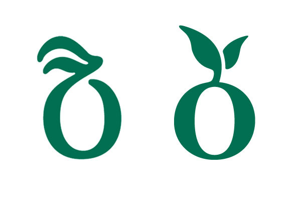
Less onion, more fruit.

Before and after.


